Client Overview: Acquisition and Transformation
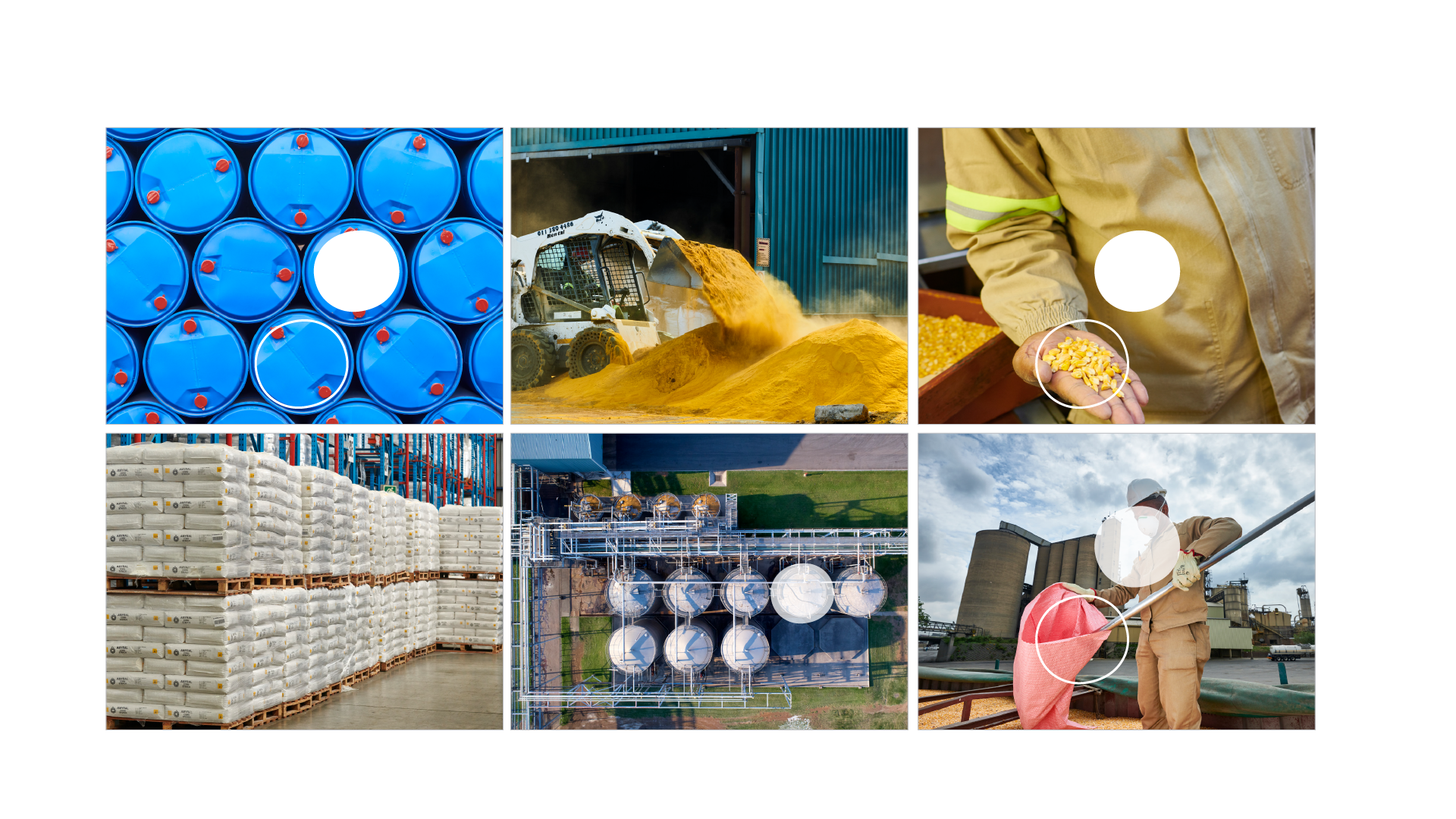
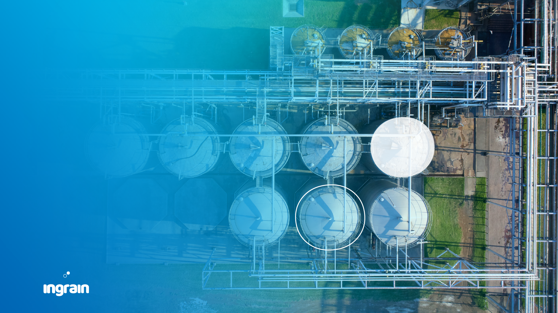
Barloworld Limited’s acquisition of the starch division from Tongaat Hulett marked the starting point of a transformative journey. This division, known for producing high-quality starch and glucose from non-GMO maize, was poised for a rebranding that would reflect its new ownership and direction.
Request: A New Identity under Barloworld
Tongaat Hulett Starch required a brand-new identity, one that would befit its status under the Barloworld umbrella. The remit was to create a name and visual identity that echoed its industry-leading position and its commitment to delivering quality products.
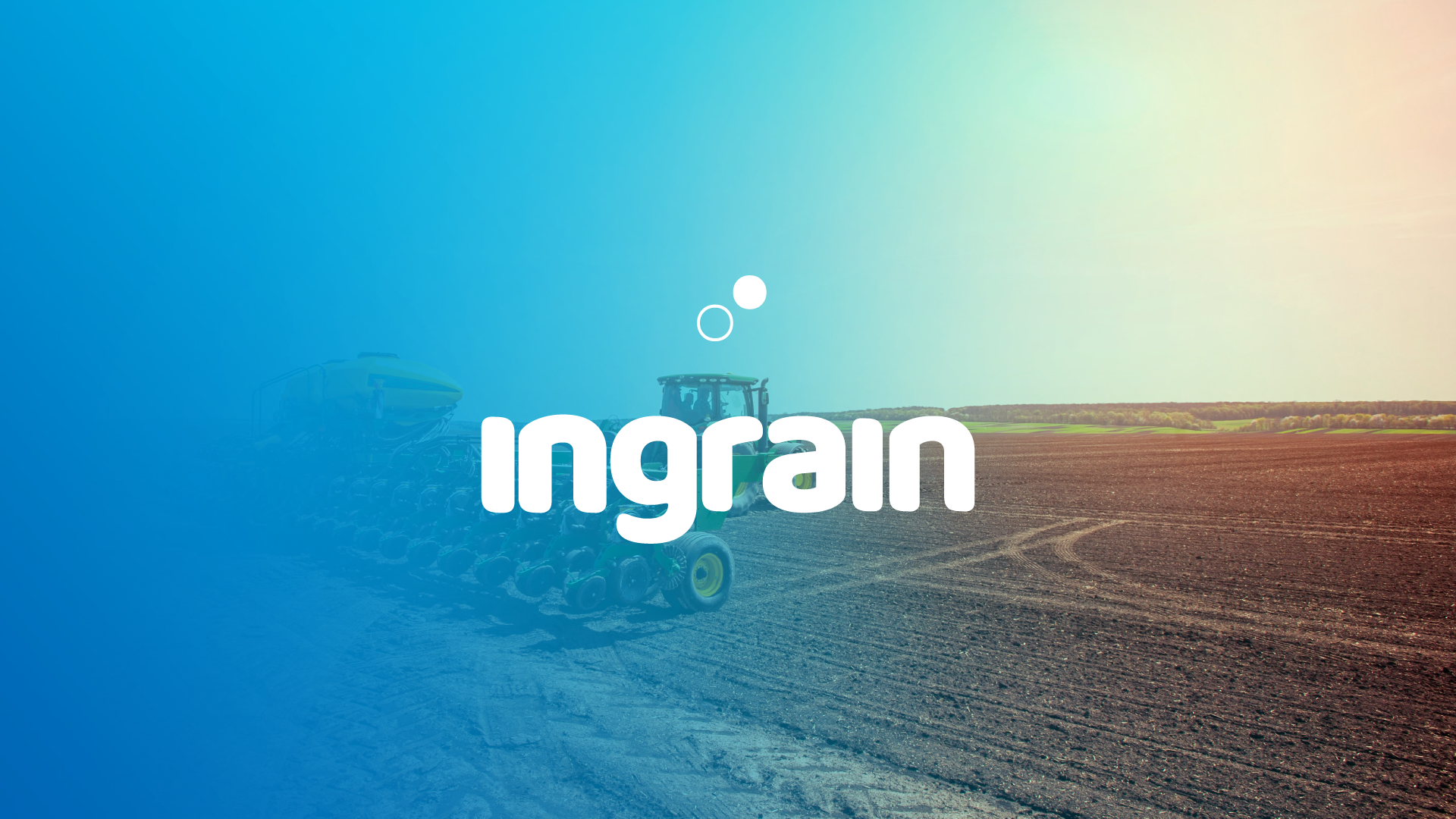
Creatives: Establishing the Ingrain Brand
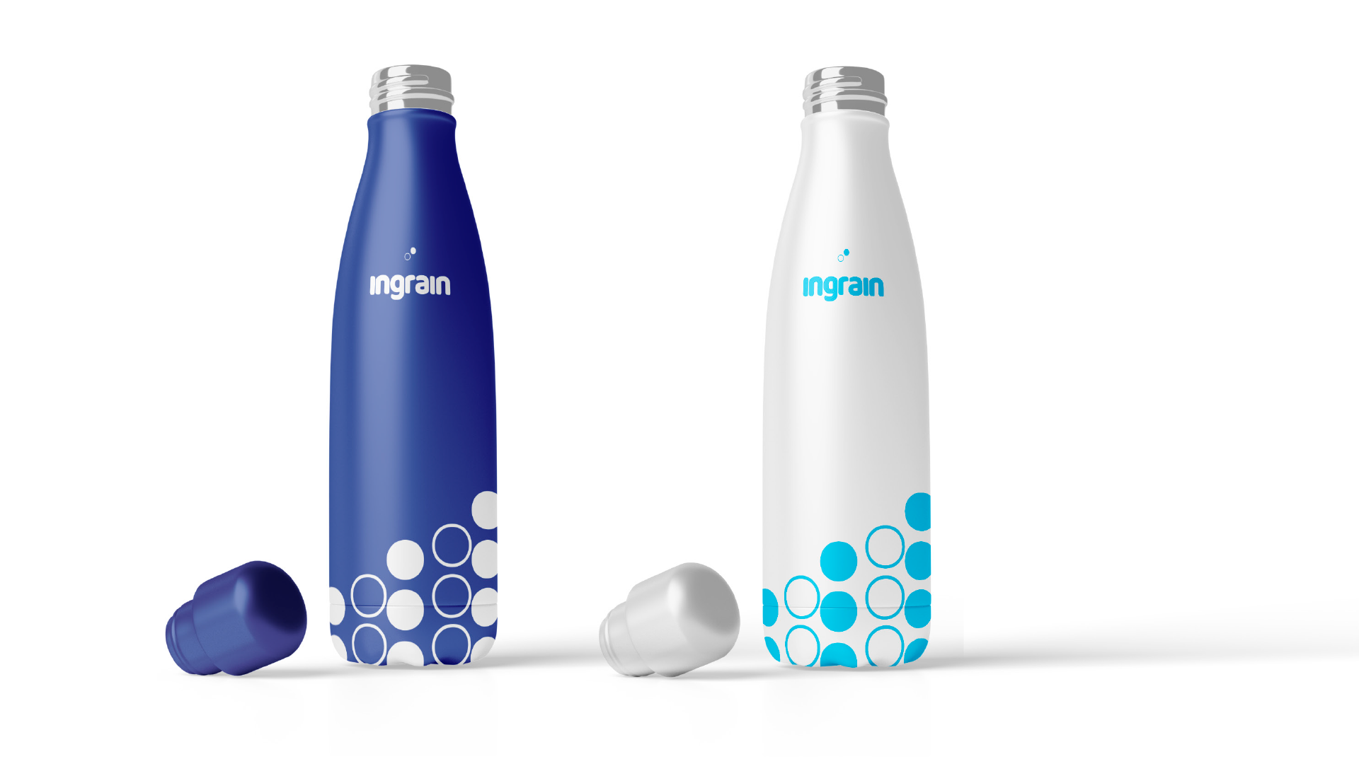
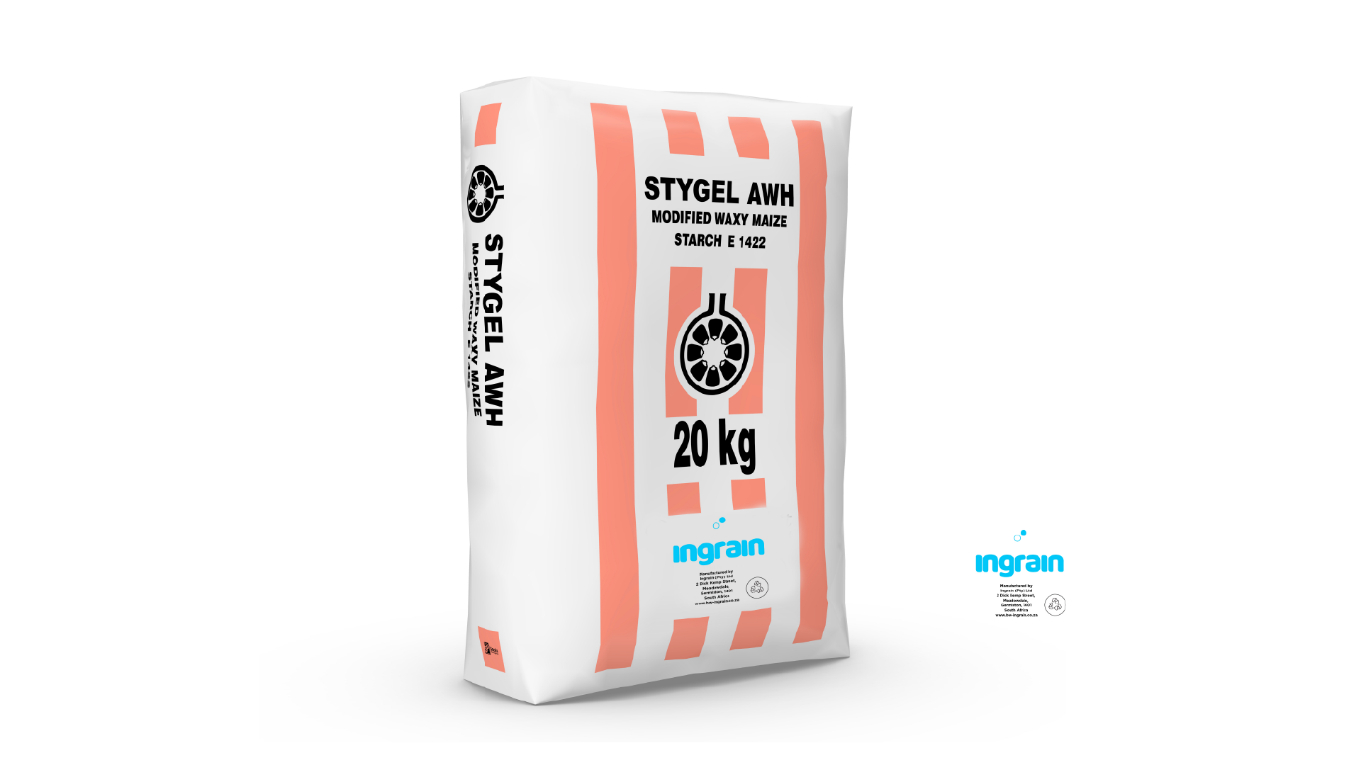
Our creative mandate led to the inception of the name "Ingrain" and the development of a new logo, visual language, and brand identity. The rollout was comprehensive, touching points across website design, branded collateral, and signage to ensure a cohesive brand experience.